Prebuilt workflow · Direction & critique

Brand Explorer

Describe your brand and explore three deliberately divergent directions — each rendered as a pitch-deck board — then get a scored review and commit to a winner with a full style guide.

· You bring Brand brief· 3 direction boards· review.md· DESIGN.md

STICKY

Brand Explorer — diverge before you commit.

  1. Describe your brand below. Have an inspiration image? Drop it in the node underneath and connect it to "Explore 3 Directions"
  2. Run the workflow — you'll get 3 deliberately different brand directions, each rendered as a board, plus a scored review that picks a winner
  3. The Brand Style Guide follows the review's pick. Prefer a different direction? Connect that board to "Brand Style Guide" and re-run just that node
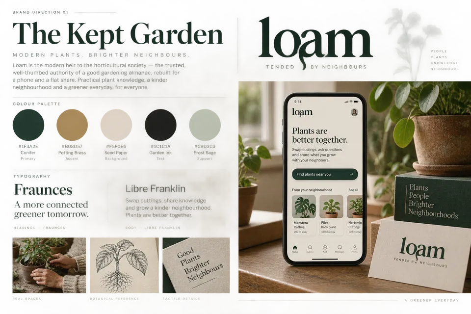
Board: Direction 1
GPT Image 2.5 SunburstAutoStyles

From the connected Brand Directions document, visualize Direction 1 ONLY — ignore the other directions entirely. Create a single polished brand exploration board (landscape) laid out like a page from an agency pitch deck: - The direction name as a styled headline, set in its recommended typography - A logo concept in this direction's logo territory - Color palette swatches with hex labels - Typography specimen (heading + body sample text) - 2-3 small imagery/texture tiles sh…

11 lines · 673 charsEditorExpand
AttachmentsResponse
IMAGE$0.05Run
IMAGE
Direction 1 Board
OUT_N2.PNG3:2
IMAGE
Direction Review
Claude Opus 5.5High

You are a creative director reviewing three brand direction boards against the connected brand brief. For each board, write: ## Direction N - **Score:** X/10 against the brief (audience fit, distinctiveness, longevity) - **What's working:** 2-3 specifics - **What's risky:** 2-3 specifics - **One evolution:** the single change that would most improve it Then finish with: ## Recommendation Name the winning direction and why, in 3-4 sentences. If elements from the runners-up a…

12 lines · 618 charsEditorExpand
AttachmentsResponse
CODE$0.13Run
COMPOSEmarkdown
# Loam — Brand Direction Review

*Reviewed against the brief: warm, patient, a little nerdy; hands in the soil, never twee; must not look like every other plant app; must work for a 24-year-old renter and a 60-year-old gardener.*

---

## Direction 1 — The Kept Garden

- **Score:** 5/10 (audience fit 7, distinctiveness 3, longevity 6)

### What's working
- **The almanac positioning is smart.** "Modern heir to the horticultural society" gives the 60-year-old gardener an immediate reason to trust Loam, and gives the renter a sense of inherited wisdom rather than a gimmick.
- **Fraunces + Libre Franklin is a mature, readable pairing.** The soft serif carries warmth and patience; Franklin keeps the UI legible at small sizes for older eyes.
- **The descender flourish on the "a" in the wordmark** is the only genuinely ownable gesture here, and it hints at a root dropping into soil.

### What's risky
- **It is the category default.** Deep forest green, brass/terracotta-adjacent tan, cream paper and sage are *exactly* the palette the brief tells us to avoid. Put this next to three competitor apps and it disappears.
- **The photography leans lifestyle-catalogue** (knit sleeves, clay pots, botanical etching) — tasteful, but closer to a homeware brand than a neighbourhood swap. The "nerdy" and "hands in the soil" notes are muted.
- **The app UI is generic.** Big green pill CTA, card carousel, standard tab bar — nothing about the product experience feels specific to Loam.

### One evolution
**Replace the palette entirely.** Keep the Fraunces type and the almanac voice, but swap Conifer/Sage for something off-category (e.g. an ink blue or soil umber with a sharp accent). The concept survives; the sameness doesn't.

---

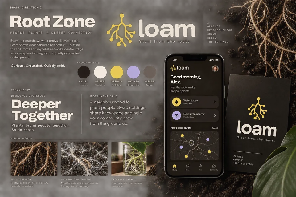
## Direction 2 — Root Zone

- **Score:** 7/10 (audience fit 6, distinctiveness 9, longevity 6)

### What's working
- **The strongest idea of the three.** "Show what happens beneath the pot" is a genuinely differentiated insight, and mycelial networks as a metaphor for neighbours is conceptually airtight for a swap app.
- **The root/network mark doubles as product UI.** The "Your plant network" map literally extends the logo into a feature — that's a system, not just a logo.
- **Sulphur + Lichen Lilac on Humus is unlike anything in the category.** Nobody else in plant apps is using this palette; it's instantly recognisable.

### What's risky
- **Dark mode …
Direction Review66 lines · 5.8k chars
CODE
COMPOSETextReq

Loam — a neighbourhood houseplant swap and care app. City renters and first-time plant owners trade cuttings with people nearby, and Loam reminds them when to water, feed and repot. It should feel warm, patient and a little nerdy — hands in the soil, never twee or cutesy. It must not look like every other plant app (leaf-in-a-circle marks, mid greens, terracotta). It has to work for a 24-year-old renter and a 60-year-old gardener alike.

TEXT
Explore 3 Directions
Claude Opus 5.5High

You are a brand strategist. From the connected brand brief (and inspiration image, if provided), develop THREE deliberately divergent brand directions. They must feel like they came from three different studios — do not converge on one safe middle ground. - **Direction 1 — The Classic:** the strongest version of what this category is expected to look like. Refined, trusted, best-in-class execution of the convention. - **Direction 2 — The Challenger:** deliberately breaks the…

19 lines · 1.4k charsEditorExpand
AttachmentsResponse
CODE$0.18Run
COMPOSEmarkdown
# Loam: Three Divergent Brand Directions

*Every competitor shows the leaf. Loam's name points somewhere else: the soil, the neighbourhood, the slow knowledge of care. Each direction below avoids the category clichés named in the brief. That means no leaf-in-a-circle marks, no mid greens and no terracotta. Each also stays legible and respectful for a 24-year-old renter and a 60-year-old gardener alike.*

---

## Direction 1: The Kept Garden

- **Big idea:** Loam as the modern heir to the horticultural society, with the trusted, well-thumbed authority of a good gardening almanac, rebuilt for a phone and a flat share.
- **Personality:** Assured, generous, knowledgeable
- **Color palette:**
  - `#1F3A2E` **Conifer** (primary). A deep, almost-black evergreen. It reads as "plants" without ever touching the mid-green cliché.
  - `#B08D57` **Potting Brass** (accent). Used for reminders, badges and swap confirmations, like the brass labels on a glasshouse bench.
  - `#F5F0E6` **Seed Paper** (background). A warm off-white that is kinder to older eyes than pure white.
  - `#1C1C1A` **Garden Ink** (text). A high-contrast near-black.
  - `#C9D3C3` **Frost Sage** (support). Used for dividers, empty states and calendar grids.
- **Typography:**
  - **Headings:** *Fraunces* (soft optical size, low "wonk"). It has a literary, almanac-like warmth.
  - **Body:** *Libre Franklin*. It is sturdy, highly readable at small sizes and familiar to every generation.
- **Imagery & texture:**
  - Natural-light photography of *real* windowsills, balconies and kitchen tables, with the owner's hands in frame.
  - Fine-line botanical drawings used sparingly for care guides, in the manner of a reference book rather than decoration.
  - Subtle paper grain on backgrounds, plus ruled lines echoing a gardener's notebook.
- **Logo territory:** A confident serif **wordmark** in Fraunces with a custom ligature joining the *o* and *a*. The join is a single descending stroke that suggests a root, discovered rather than announced. It includes no leaf and no circle.
- **Tagline sketch:** *"Tended by neighbours."*
- **This direction is NOT:**
  - Heritage cosplay. It avoids crests, faux-Victorian flourishes and "Est. 1890" nostalgia.
  - Precious or luxury-garden-centre. It should feel like a library, not a boutique.
  - Stock-photo perfect. It never shows styled, plant-filled lofts that no renter actual…
Brand Directions99 lines · 8k chars
CODE
Board: Direction 2
GPT Image 2.5 SunburstAutoStyles

From the connected Brand Directions document, visualize Direction 2 ONLY — ignore the other directions entirely. Create a single polished brand exploration board (landscape) laid out like a page from an agency pitch deck: - The direction name as a styled headline, set in its recommended typography - A logo concept in this direction's logo territory - Color palette swatches with hex labels - Typography specimen (heading + body sample text) - 2-3 small imagery/texture tiles sh…

11 lines · 673 charsEditorExpand
AttachmentsResponse
IMAGE$0.09Run
IMAGE
Direction 2 Board
OUT_N9.PNG3:2
IMAGE
IMAGE
Upload image
IMAGE
STICKY

The style guide below is written for the review's recommended direction. Prefer another one — or want it grounded in the visuals? Connect that direction's board to "Brand Style Guide" and re-run just that node. Want a full asset kit from a finished logo? Open the Brand Kit tool next.

Board: Direction 3
GPT Image 2.5 SunburstAutoStyles

From the connected Brand Directions document, visualize Direction 3 ONLY — ignore the other directions entirely. Create a single polished brand exploration board (landscape) laid out like a page from an agency pitch deck: - The direction name as a styled headline, set in its recommended typography - A logo concept in this direction's logo territory - Color palette swatches with hex labels - Typography specimen (heading + body sample text) - 2-3 small imagery/texture tiles sh…

11 lines · 673 charsEditorExpand
AttachmentsResponse
IMAGE$0.09Run
IMAGE
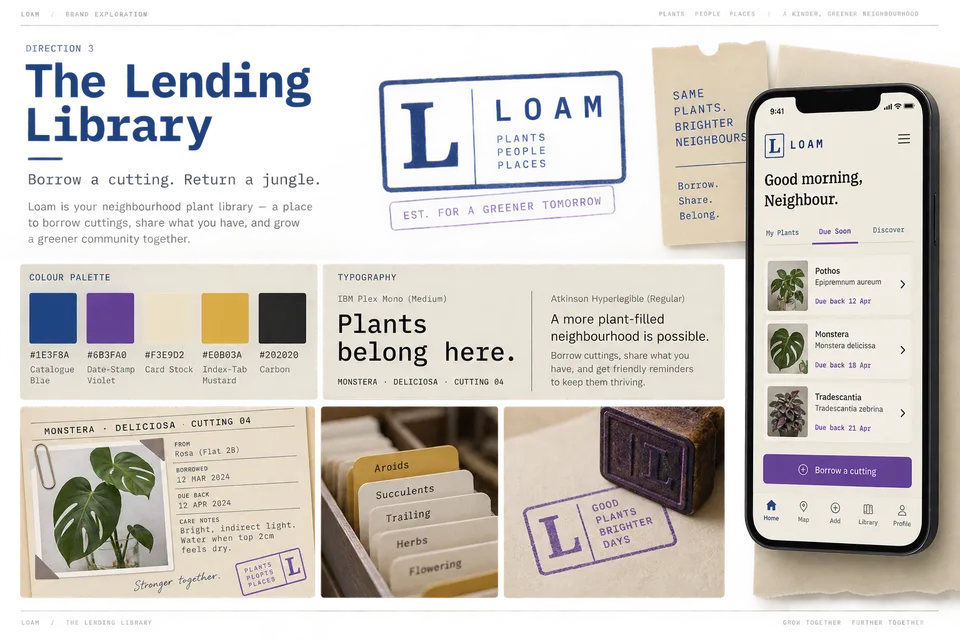
Direction 3 Board
OUT_N13.PNG3:2
IMAGE
Brand Style Guide
Claude Opus 5.5High

Using the connected brand brief and Direction Review as ground truth, write a comprehensive DESIGN.md brand guide for the direction the review recommends. If a direction board image is also connected, that board is the direction to commit to — build the guide for it and match its visuals exactly, even if the review recommended another. Include: - Brand story, positioning, and voice (with example copy in-voice and off-voice) - Logo usage, clear space, minimum size, and misuse…

10 lines · 825 charsEditorExpand
AttachmentsResponse
STYLE$0.52Run
DIRECTLoam — The Lending Library (Grounded)
Colors
primary#23408E
secondary#5B3F9E
accent#E8D14A
soil#5A3E2B
background#F4EEDF
surface#FBF7EC
surface-raised#FFFDF6
foreground#1B1F2E
Typography
displayFraunces · 56px · 600
heading-1Fraunces · 36px · 600
heading-2Fraunces · 26px · 600
heading-3Fraunces · 20px · 600
body-lgAtkinson Hyperlegible · 19px · 400
Voice
WarmPatientA little nerdyPracticalNeighbourlyUnhurried

A friendly librarian who also keeps a greenhouse. Plain-spoken, specific and kind. It knows the Latin name and drops it in lightly, explains the why behind care, and never scolds. Library language (borrow, due back, catalogue, card, shelf, stamp) is the house dialect: use it where it adds charm and clarity, and drop it where it would obscure an action.

STYLE
Run all

A real run, unedited6 generations · $1.07 of walletBrand and inputs are fictional, made in Vmotif · 2026-09-24

What came back

Straight off the canvas.

Everything below is what this run returned, untouched.

  • Brand Directionsmarkdown
    # Loam: Three Divergent Brand Directions
    
    *Every competitor shows the leaf. Loam's name points somewhere else: the soil, the neighbourhood, the slow knowledge of care. Each direction below avoids the category clichés named in the brief. That means no leaf-in-a-circle marks, no mid greens and no terracotta. Each also stays legible and respectful for a 24-year-old renter and a 60-year-old gardener alike.*
    
    ---
    
    ## Direction 1: The Kept Garden
    
    - **Big idea:** Loam as the modern heir to the horticultural society, with the trusted, well-thumbed authority of a good gardening almanac, rebuilt for a phone and a flat share.
    - **Personality:** Assured, generous, knowledgeable
    - **Color palette:**
      - `#1F3A2E` **Conifer** (primary). A deep, almost-black evergreen. It reads as "plants" without ever touching the mid-green cliché.
      - `#B08D57` **Potting Brass** (accent). Used for reminders, badges and swap confirmations, like the brass labels on a glasshouse bench.
      - `#F5F0E6` **Seed Paper** (background). A warm off-white that is kinder to older eyes than pure white.
  • Direction Reviewmarkdown
    # Loam — Brand Direction Review
    
    *Reviewed against the brief: warm, patient, a little nerdy; hands in the soil, never twee; must not look like every other plant app; must work for a 24-year-old renter and a 60-year-old gardener.*
    
    ---
    
    ## Direction 1 — The Kept Garden
    
    - **Score:** 5/10 (audience fit 7, distinctiveness 3, longevity 6)
    
    ### What's working
    - **The almanac positioning is smart.** "Modern heir to the horticultural society" gives the 60-year-old gardener an immediate reason to trust Loam, and gives the renter a sense of inherited wisdom rather than a gimmick.
    - **Fraunces + Libre Franklin is a mature, readable pairing.** The soft serif carries warmth and patience; Franklin keeps the UI legible at small sizes for older eyes.
    - **The descender flourish on the "a" in the wordmark** is the only genuinely ownable gesture here, and it hints at a root dropping into soil.
  • Brand Style GuideDESIGN.md
    ---
    version: alpha
    name: Loam — The Lending Library (Grounded)
    description: "A warm, tactile library-card system for Loam, the neighbourhood houseplant swap and care app. Catalogue ink and date-stamp violet on card stock, grounded with humus brown and a sharp Sulphur accent."
    colors:
      primary: "#23408E"
      on-primary: "#FBF7EC"
      secondary: "#5B3F9E"
      on-secondary: "#FBF7EC"
      accent: "#E8D14A"
      on-accent: "#1B1F2E"
      soil: "#5A3E2B"
      on-soil: "#F4EEDF"
      background: "#F4EEDF"
How it runs

Four stages, in order.

What each stage reads, what it makes and what it cost on this run. Each stage starts once the one before it finishes. Steps inside a stage don’t wait on each other, so they run side by side.

  1. 01

    Explore 3 Directions

    Reads your inputsMakes Brand Directions

    1 stepClaude Opus 5.5$0.18

  2. 02

    3 images

    Reads stage 01

    • Board: Direction 1
    • Board: Direction 2
    • Board: Direction 3

    3 steps, side by sideGPT Image 2.5 Sunburst$0.24

  3. 03

    Direction Review

    Reads your inputs and stage 02Makes Direction Review

    1 stepClaude Opus 5.5$0.13

  4. 04

    Brand Style Guide

    Reads your inputs and stage 03Makes DESIGN.md

    1 stepClaude Opus 5.5$0.52

From your agent

Or let your agent run it.

This run went through the Vmotif MCP server, the way Claude Code, Cursor or any MCP client drives it: seed the canvas, fill the inputs, run the graph.

create_canvas({ premade_workflow_id: "brand-explorer" })
update_canvas({ canvas_id, updates: [/* your inputs */] })
run_workflow({ workflow_id: canvas_id })
MCP docs
Where it fits

Part of a bigger job.

More in Direction & critique

Get a point of view before you build — synthesized direction from references, or honest feedback on what exists.