Prebuilt workflow · Direction & critique

Design Critique

Get a structured, scored critique of any UI — strengths, critical issues, an accessibility audit, and a fix checklist.

· You bring UI screenshot· critique.md· checklist.md

Design Critique
Claude Opus 5.5High

Provide a professional design critique of this UI in Markdown: # Design Critique ## Score: X/10 ## Executive Summary [2-3 sentence overview of the design's effectiveness] ## What's Working Well ✓ - [Specific strength with example from the design] - [Another strength] - [Keep doing this] ## Critical Issues ✗ ### 1. [Issue Name] - Priority: High/Medium/Low **Problem:** [Describe what's wrong] **Impact:** [Why this matters for users] **Fix:** [Specific actionable solution]…

49 lines · 1.2k charsEditorExpand
AttachmentsResponse
CODE$0.16Run
COMPOSEmarkdown
# Design Critique

## Score: 8/10

## Executive Summary
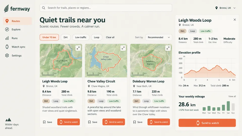
Fernway is a calm, cohesive trail-discovery dashboard with a strong brand voice, a clear three-column layout, and well-chosen earthy colors that fit the "quiet trails" promise. The main weaknesses are **redundancy and competing CTAs**. A repeated orange "Send to watch" button appears four times, and tags duplicate the active filters. There are also some **low-contrast secondary text and tags**, and a detail panel that mixes route data with unrelated personal stats.

## What's Working Well ✓
- **Strong brand-to-content alignment:** The fern logo, muted greens, and the headline *"Quiet trails near you / Scenic routes. Fewer crowds. A calmer run."* create an immediately understandable, emotionally consistent product.
- **Map thumbnails as primary content:** Each card leads with a topographic map, a bold orange route line, and a scale bar. This lets runners compare route shape and terrain at a glance.
- **Consistent card anatomy:** Title → location → key stats (distance, climb) → tags → description → actions. The pattern is identical across all three cards, which makes scanning effortless.
- **Clear active filter state:** "Under 10 km" uses an orange outline and tint that distinguishes it from inactive chips. "Clear all" is also easy to find.
- **Useful elevation profile:** The chart has labeled axes, a soft filled area, and a Min / Max / Total climb summary. It gives meaningful detail without overwhelming the user.
- **Restrained color usage:** Orange is reserved for route lines, the active nav item, the active filter, and CTAs, so the palette stays disciplined.

## Critical Issues ✗

### 1. Competing Primary CTAs - Priority: High
**Problem:** Four solid orange "Send to watch" buttons are visible at once: three on the cards and one large button in the detail panel. The panel CTA is the most prominent element on the page, even though it duplicates the card action for Leigh Woods Loop.
**Impact:** Users cannot tell which action is primary, and the page feels louder than its "calm" positioning. The repetition also dilutes the value of orange as an attention signal.
**Fix:**
- Keep the solid orange CTA **only in the detail panel**.
- Downgrade the card actions to a secondary style, such as an outlined button or an icon button with a tooltip.
- Alternatively, show card actions on hover or focus only.

### 2. No…
Design Critique107 lines · 11k chars
CODE
IMAGE
Upload UI Screenshot
Upload UI Screenshot16:9
IMAGE
Action Checklist
Claude Opus 5.5High

Analyze this UI and create an actionable improvement checklist in Markdown: # UI Improvement Checklist ## Before You Start - [ ] Take a screenshot of current state for comparison - [ ] Review with stakeholders which issues to prioritize --- ## High Priority (Fix First) ### Layout & Structure - [ ] [Specific task, e.g., "Increase padding around hero section to 64px"] - [ ] [Another specific task] ### Typography - [ ] [e.g., "Change body text from 14px to 16px for readabi…

60 lines · 1.4k charsEditorExpand
AttachmentsResponse
CODE$0.19Run
COMPOSEmarkdown
# UI Improvement Checklist — Fernway "Quiet trails near you"

## Before You Start
- [ ] Take a full-page screenshot of the current state at 1792×1008 and at 1440px width for comparison
- [ ] Review with stakeholders which issues to prioritize. Flag these open questions:
  - Should selecting a card update the right-hand detail panel?
  - Should the "Your weekly mileage" widget stay on the Routes page?
- [ ] Export the current color tokens (orange CTA, green chip, beige chip, gray chip, body gray) so contrast can be measured against exact hex values

---

## High Priority (Fix First)

### Layout & Structure
- [ ] **Add a selected state to the active route card.** The detail panel shows "Leigh Woods Loop", but no card looks selected.
  - Apply a 2px orange border (`#E8623A`) to the selected card
  - Add a light orange tint background (`#FFF4EF`) behind the card title area
  - Add `aria-current="true"` to the selected card
- [ ] **Move "Your weekly mileage" out of the route detail panel.** It is unrelated to the selected route and dilutes the panel's purpose.
  - Option A: move it to the Runs page
  - Option B: place it in the left sidebar above the "Wilder days ahead." footer
  - Option C: keep it, but separate it with a 24px gap and a distinct card container (its own border and radius)
- [ ] **Make the primary action in each card unambiguous.**
  - Keep "Send to watch" as the filled orange button
  - Change "Save" to a secondary outlined button: 1px border `#D6D3CC`, 40px height, 12px horizontal padding
  - The goal is for "Save" to read as a button rather than floating text
- [ ] **Remove the duplicate primary CTA conflict.** Four identical orange "Send to watch" buttons compete visually.
  - Keep the filled style only in the detail panel
  - On cards, switch "Send to watch" to an outlined orange style: 1px `#E8623A` border, orange text, transparent fill
  - Alternatively, show the filled style only on hover or on the selected card
- [ ] **Align card footers to a common baseline.** Card descriptions are 2 lines (Leigh Woods) vs. 3 lines (Chew Valley and Dolebury).
  - Set the card to `display: flex; flex-direction: column`
  - Give the description `flex: 1`
  - Apply `margin-top: auto` to the action row so the buttons sit at an identical y-position
- [ ] **Add a results count** to the left of "Sort by" (e.g., "3 routes"), in 14px `#5F6B66`, so users can see t…
Action Checklist158 lines · 11k chars
CODE
Run all

A real run, unedited2 generations · $0.36 of walletBrand and inputs are fictional, made in Vmotif · 2026-09-24

What came back

Straight off the canvas.

Everything below is what this run returned, untouched.

  • Design Critiquemarkdown
    # Design Critique
    
    ## Score: 8/10
    
    ## Executive Summary
    Fernway is a calm, cohesive trail-discovery dashboard with a strong brand voice, a clear three-column layout, and well-chosen earthy colors that fit the "quiet trails" promise. The main weaknesses are **redundancy and competing CTAs**. A repeated orange "Send to watch" button appears four times, and tags duplicate the active filters. There are also some **low-contrast secondary text and tags**, and a detail panel that mixes route data with unrelated personal stats.
    
    ## What's Working Well ✓
    - **Strong brand-to-content alignment:** The fern logo, muted greens, and the headline *"Quiet trails near you / Scenic routes. Fewer crowds. A calmer run."* create an immediately understandable, emotionally consistent product.
    - **Map thumbnails as primary content:** Each card leads with a topographic map, a bold orange route line, and a scale bar. This lets runners compare route shape and terrain at a glance.
    - **Consistent card anatomy:** Title → location → key stats (distance, climb) → tags → description → actions. The pattern is identical across all three cards, which makes scanning effortless.
    - **Clear active filter state:** "Under 10 km" uses an orange outline and tint that distinguishes it from inactive chips. "Clear all" is also easy to find.
    - **Useful elevation profile:** The chart has labeled axes, a soft filled area, and a Min / Max / Total climb summary. It gives meaningful detail without overwhelming the user.
    - **Restrained color usage:** Orange is reserved for route lines, the active nav item, the active filter, and CTAs, so the palette stays disciplined.
  • Action Checklistmarkdown
    # UI Improvement Checklist — Fernway "Quiet trails near you"
    
    ## Before You Start
    - [ ] Take a full-page screenshot of the current state at 1792×1008 and at 1440px width for comparison
    - [ ] Review with stakeholders which issues to prioritize. Flag these open questions:
      - Should selecting a card update the right-hand detail panel?
      - Should the "Your weekly mileage" widget stay on the Routes page?
    - [ ] Export the current color tokens (orange CTA, green chip, beige chip, gray chip, body gray) so contrast can be measured against exact hex values
    
    ---
    
    ## High Priority (Fix First)
    
    ### Layout & Structure
How it runs

One stage, all at once.

What each stage reads, what it makes and what it cost on this run. Steps inside a stage don’t wait on each other, so they run side by side.

  1. 01

    Design Critique & Action Checklist

    Reads your inputsMakes 2 files

    2 steps, side by sideClaude Opus 5.5$0.36

From your agent

Or let your agent run it.

This run went through the Vmotif MCP server, the way Claude Code, Cursor or any MCP client drives it: seed the canvas, fill the inputs, run the graph.

create_canvas({ premade_workflow_id: "design-critique" })
update_canvas({ canvas_id, updates: [/* your inputs */] })
run_workflow({ workflow_id: canvas_id })
MCP docs
More in Direction & critique

Get a point of view before you build — synthesized direction from references, or honest feedback on what exists.