Prebuilt workflow · Design systems & tokens

Design System Starter

Build a starter system from a brand reference: tokens, globals.css, a Tailwind config, base components, and a preview board.

· You bring Brand assets· tokens.json· globals.css· tailwind.config.ts· components.tsx· preview

COMPOSEjson
{
  "meta": {
    "generator": "vmotif-design-system-starter",
    "format": "tailwind-v4"
  },
  "colors": {
    "core": {
      "primary": "oklch(0.66 0.18 40)",
      "secondary": "oklch(0.33 0.045 162)",
      "accent": "oklch(0.59 0.07 132)",
      "background": "oklch(0.965 0.008 85)",
      "foreground": "oklch(0.25 0.012 245)",
      "muted": "oklch(0.93 0.012 90)",
      "mutedForeground": "oklch(0.5 0.03 140)",
      "card": "oklch(0.985 0.005 85)",
      "cardForeground": "oklch(0.25 0.012 245)",
      "border": "oklch(0.87 0.012 90)",
      "input": "oklch(0.985 0.005 85)",
      "ring": "oklch(0.66 0.18 40)",
      "destructive": "oklch(0.55 0.2 27)",
      "success": "oklch(0.52 0.1 150)",
      "warning": "oklch(0.76 0.15 75)"
    },
    "coreDark": {
      "primary": "oklch(0.72 0.17 42)",
      "secondary": "oklch(0.55 0.07 158)",
      "accent": "oklch(0.7 0.08 132)",
      "background": "oklch(0.2 0.015 165)",
      "foreground": "oklch(0.95 0.008 85)",
      "muted": "oklch(0.27 0.018 165)",
      "mutedForeground": "oklch(0.72 0.03 130)",
      "card": "oklch(0.24 0.018 165)",
      "cardForeground": "oklch(0.95 0.008 85)",
      "border": "oklch(0.34 0.02 165)",
      "input": "oklch(0.27 0.018 165)",
      "ring": "oklch(0.72 0.17 42)",
      "destructive": "oklch(0.66 0.19 27)",
      "success": "oklch(0.68 0.12 150)",
      "warning": "oklch(0.8 0.14 78)"
    },
    "ramps": {
      "primary": {
        "50": {
          "oklch": "var(--color-primary)",
          "hex": "#FFEEE5"
        },
        "100": {
          "oklch": "var(--color-primary)",
          "hex": "#FFDDCF"
        },
        "200": {
          "oklch": "var(--color-primary)",
          "hex": "#FFC8B4"
        },
        "300": {
          "oklch": "var(--color-primary)",
          "hex": "#F9AB8F"
        },
        "400": {
          "oklch": "var(--color-primary)",
          "hex": "#EC8A67"
        },
        "500": {
          "oklch": "var(--color-primary)",
          "hex": "#E25C26"
        },
        "600": {
          "oklch": "var(--color-primary)",
          "hex": "#B8430F"
        },
        "700": {
          "oklch": "var(--color-primary)",
          "hex": "#86300C"
        },
        "800": {
          "oklch": "var(--color-primary)",
          "hex": "#56200B"
        }
      },
      "secondary": {
        "50": {
          "oklch": "var(--colo…
design-tokens.json271 lines · 7.3k chars
CODE
Theme System
Claude Opus 5.5High

Build a starter design system from this brand reference. Return a cohesive token set that can drive: - DESIGN.md brand guide - design-tokens.json - globals.css for Tailwind v4 - tailwind.config.ts compatibility - an exportable visual theme board Prioritize: 1. Logo usage, brand voice, imagery, iconography, and motion rules 2. Primary, secondary, accent, and neutral palettes 3. Headline/body/label typography 4. Practical spacing, radius, and shadow tokens 5. Surfaces that fe…

15 lines · 537 charsEditorExpand
AttachmentsResponse
CODE$0.41Run
IMAGE
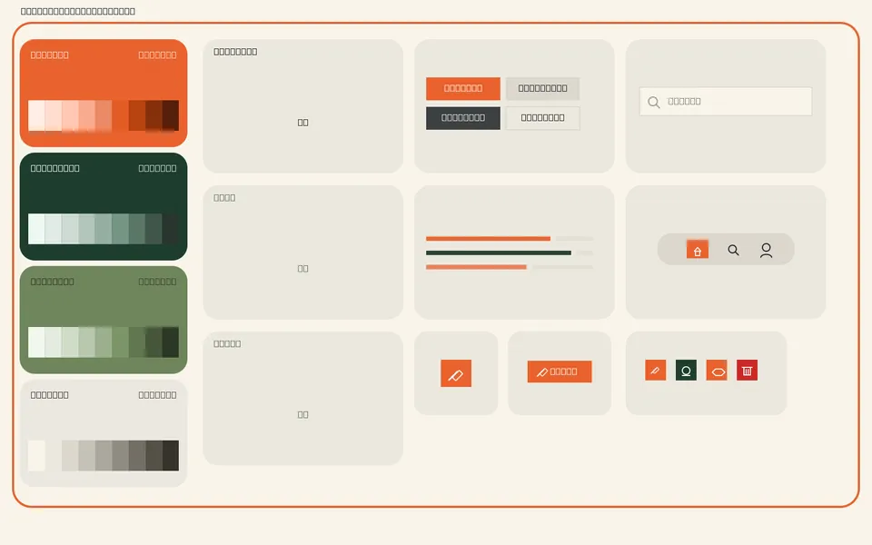
design-system-preview.png
design-system-preview.png3:2
IMAGE
COMPOSEcss
@import "tailwindcss";

@theme {
  /* Colors (light) */
  --color-primary: oklch(0.66 0.18 40);
  --color-secondary: oklch(0.33 0.045 162);
  --color-accent: oklch(0.59 0.07 132);
  --color-background: oklch(0.965 0.008 85);
  --color-foreground: oklch(0.25 0.012 245);
  --color-muted: oklch(0.93 0.012 90);
  --color-muted-foreground: oklch(0.5 0.03 140);
  --color-card: oklch(0.985 0.005 85);
  --color-card-foreground: oklch(0.25 0.012 245);
  --color-border: oklch(0.87 0.012 90);
  --color-input: oklch(0.985 0.005 85);
  --color-ring: oklch(0.66 0.18 40);
  --color-destructive: oklch(0.55 0.2 27);
  --color-success: oklch(0.52 0.1 150);
  --color-warning: oklch(0.76 0.15 75);

  /* Typography */
  --font-sans: "Inter", ui-sans-serif, system-ui, -apple-system, "Segoe UI", Roboto, sans-serif;
  --font-mono: "JetBrains Mono", ui-monospace, SFMono-Regular, Menlo, Consolas, monospace;
  --font-serif: "Söhne Schmal", "Söhne Condensed", "Barlow Condensed", "Roboto Condensed", "Arial Narrow", sans-serif;

  /* Font Sizes */
  --text-xs: 0.75rem;
  --text-sm: 0.875rem;
  --text-base: 1rem;
  --text-lg: 1.125rem;
  --text-xl: 1.25rem;
  --text-2xl: 1.5rem;
  --text-3xl: 1.875rem;
  --text-4xl: 2.5rem;
  --text-5xl: 3.5rem;

  /* Font Weights */
  --font-normal: 400;
  --font-medium: 500;
  --font-semibold: 600;
  --font-bold: 700;

  /* Line Heights */
  --leading-tight: 1.1;
  --leading-normal: 1.5;
  --leading-relaxed: 1.65;

  /* Letter Spacing */
  --tracking-tight: -0.015em;
  --tracking-normal: 0em;
  --tracking-wide: 0.24em;

  /* Spacing */
  --spacing-xs: 4px;
  --spacing-sm: 8px;
  --spacing-md: 16px;
  --spacing-lg: 24px;
  --spacing-xl: 32px;
  --spacing-2xl: 48px;
  --spacing-3xl: 64px;
  --spacing-4xl: 96px;

  /* Border Radius */
  --radius-none: 0px;
  --radius-sm: 6px;
  --radius-md: 10px;
  --radius-lg: 14px;
  --radius-xl: 20px;
  --radius-full: 9999px;

  /* Shadows */
  --shadow-sm: 0 1px 2px oklch(0.25 0.012 245 / 0.06);
  --shadow-md: 0 4px 12px -2px oklch(0.25 0.012 245 / 0.08), 0 2px 4px oklch(0.25 0.012 245 / 0.04);
  --shadow-lg: 0 12px 28px -6px oklch(0.33 0.045 162 / 0.14), 0 4px 8px oklch(0.25 0.012 245 / 0.05);
  --shadow-xl: 0 24px 56px -12px oklch(0.33 0.045 162 / 0.22), 0 8px 16px oklch(0.25 0.012 245 / 0.06);
  --shadow-glow: 0 0 0 4px oklch(0.66 0.18 40 / 0.22);

  /* Gradients */
  --gradient-forest-canopy: linear-gradient(135deg…
globals.css148 lines · 4.7k chars
CODE
IMAGE
Upload Brand Assets
Upload Brand Assets3:2
IMAGE
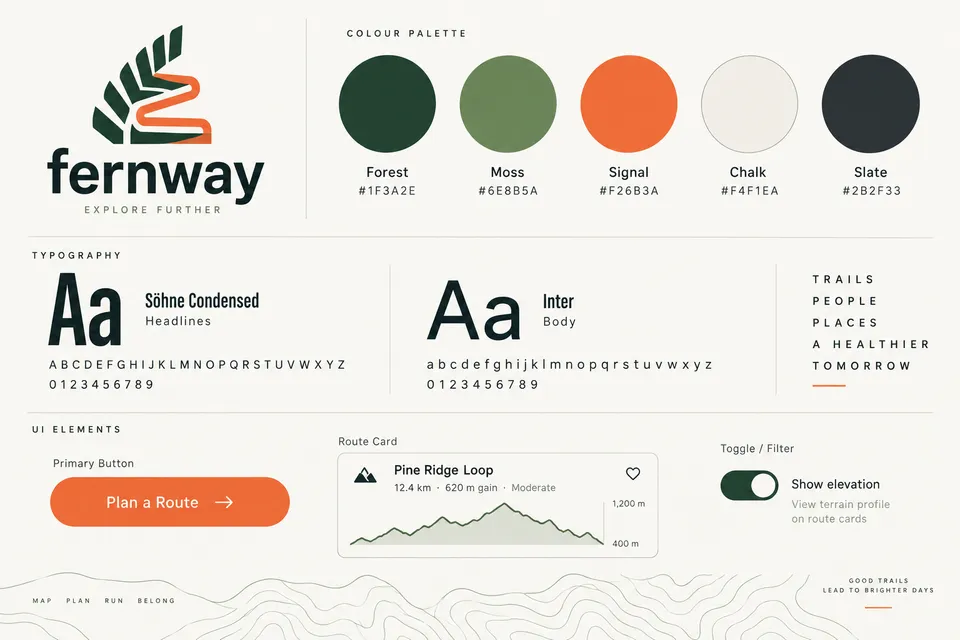
DIRECTFernway — Explore Further
Colors
primary#F26B3A
primary-hover#DE5A2A
primary-foreground#FFFFFF
primary-strong#C14A1C
secondary#1F3A2E
secondary-foreground#F4F1EA
accent#6E8B5A
accent-subtle#E3E8DA
Typography
displaySöhne Schmal · 72px · 700
h1Söhne Schmal · 48px · 700
h2Söhne Schmal · 34px · 600
h3Inter · 22px · 600
titleInter · 18px · 600
Voice
GroundedEncouragingCapableWarmUnhurried

Like a trail-savvy friend who has walked it before: clear and practical about conditions, gently optimistic about the payoff. Confident without bravado, and inclusive of every pace, from first loop to ultra.

STYLE
COMPOSEtypescript
import type { Config } from "tailwindcss"

// globals.css remains the source of truth for @theme tokens.
const config: Config = {
  "content": [
    "./app/**/*.{ts,tsx,mdx}",
    "./components/**/*.{ts,tsx}",
    "./lib/**/*.{ts,tsx}"
  ],
  "theme": {
    "extend": {
      "colors": {
        "primary": "var(--color-primary)",
        "secondary": "var(--color-secondary)",
        "accent": "var(--color-accent)",
        "background": "var(--color-background)",
        "foreground": "var(--color-foreground)",
        "muted": "var(--color-muted)",
        "mutedForeground": "var(--color-muted-foreground)",
        "card": "var(--color-card)",
        "cardForeground": "var(--color-card-foreground)",
        "border": "var(--color-border)",
        "input": "var(--color-input)",
        "ring": "var(--color-ring)",
        "destructive": "var(--color-destructive)",
        "success": "var(--color-success)",
        "warning": "var(--color-warning)"
      },
      "fontFamily": {
        "sans": [
          "var(--font-sans)"
        ],
        "mono": [
          "var(--font-mono)"
        ],
        "serif": [
          "var(--font-serif)"
        ]
      },
      "borderRadius": {
        "none": "0px",
        "sm": "6px",
        "md": "10px",
        "lg": "14px",
        "xl": "20px",
        "full": "9999px"
      },
      "boxShadow": {
        "sm": "0 1px 2px oklch(0.25 0.012 245 / 0.06)",
        "md": "0 4px 12px -2px oklch(0.25 0.012 245 / 0.08), 0 2px 4px oklch(0.25 0.012 245 / 0.04)",
        "lg": "0 12px 28px -6px oklch(0.33 0.045 162 / 0.14), 0 4px 8px oklch(0.25 0.012 245 / 0.05)",
        "xl": "0 24px 56px -12px oklch(0.33 0.045 162 / 0.22), 0 8px 16px oklch(0.25 0.012 245 / 0.06)",
        "glow": "0 0 0 4px oklch(0.66 0.18 40 / 0.22)"
      }
    }
  }
}

export default config
tailwind.config.ts60 lines · 1.8k chars
CODE
Base Components
Claude Opus 5.5High

Use the connected DESIGN.md, tokens, globals.css, and Tailwind config inputs as ground truth. Generate a starter React component file with: 1. Button - primary, secondary, ghost variants 2. Card - header, body, footer 3. Badge - semantic and neutral variants 4. Avatar - image + fallback Requirements: - TypeScript props - Tailwind CSS classes that align to the provided theme inputs - shadcn/ui-style ergonomics - Accessible focus states and keyboard-safe interactions

13 lines · 471 charsEditorExpand
AttachmentsResponse
CODE$0.78Run
COMPOSEtypescript
/**
 * Fernway UI utilities.
 * Dependency-free `cn` helper (clsx-style). If you add tailwind-merge later,
 * wrap the result with `twMerge` for conflict resolution.
 */
export type ClassValue =
  | string
  | number
  | null
  | undefined
  | false
  | ClassValue[]
  | Record<string, boolean | null | undefined>;

export function cn(...inputs: ClassValue[]): string {
  const out: string[] = [];
  const walk = (value: ClassValue): void => {
    if (!value) return;
    if (typeof value === "string" || typeof value === "number") {
      out.push(String(value));
    } else if (Array.isArray(value)) {
      value.forEach(walk);
    } else if (typeof value === "object") {
      for (const key of Object.keys(value)) {
        if (value[key]) out.push(key);
      }
    }
  };
  inputs.forEach(walk);
  return out.join(" ");
}

/** Build up to two initials from a display name, e.g. "Maya Okafor" -> "MO". */
export function getInitials(name: string | undefined, max = 2): string {
  if (!name) return "";
  return name
    .trim()
    .split(/\s+/)
    .filter(Boolean)
    .slice(0, max)
    .map((part) => part.charAt(0).toUpperCase())
    .join("");
}

/**
 * Shared, theme-aligned class fragments.
 * Tokens not present in globals.css (primary-foreground, primary-hover,
 * accent-subtle, border-strong, info) are read from optional CSS variables
 * with DESIGN.md-derived fallbacks, so you can add them to @theme later
 * without touching components.
 */
export const focusRing =
  "outline-none focus-visible:ring-2 focus-visible:ring-ring focus-visible:ring-offset-3 focus-visible:ring-offset-background";

export const motionMicro =
  "transition-[background-color,border-color,color,box-shadow,transform] duration-[120ms] ease-[cubic-bezier(0.3,0.7,0.4,1)] motion-reduce:transition-none";

export const tokens = {
  primaryForeground: "text-[var(--color-primary-foreground,#ffffff)]",
  primaryHoverBg:
    "hover:bg-[var(--color-primary-hover,color-mix(in_oklch,var(--color-primary),black_8%))]",
  accentSubtleBg:
    "bg-[var(--color-accent-subtle,color-mix(in_oklch,var(--color-accent),transparent_82%))]",
  accentSubtleHoverBg:
    "hover:bg-[var(--color-accent-subtle,color-mix(in_oklch,var(--color-accent),transparent_82%))]",
  borderStrong:
    "border-[var(--color-border-strong,color-mix(in_oklch,var(--color-border),black_14%))]",
  forestShadowXs: "shadow-[0_1px_2px_rgba(31…
utils.ts70 lines · 2.4k chars
CODE
COMPOSEtsx
import * as React from "react";
import { cn, focusRing, motionMicro, tokens } from "./utils";

export type ButtonVariant = "primary" | "secondary" | "ghost";
export type ButtonSize = "default" | "sm" | "icon";

export interface ButtonProps extends React.ButtonHTMLAttributes<HTMLButtonElement> {
  /** primary = Signal pill (one per view), secondary = Forest pill, ghost = outlined low emphasis. */
  variant?: ButtonVariant;
  /** `default` uses the DESIGN.md height for each variant (56 / 48 / 44px). */
  size?: ButtonSize;
  /** Render the child element (e.g. an <a>) with button styles. */
  asChild?: boolean;
  /** Shows a spinner, sets aria-busy and disables interaction. */
  loading?: boolean;
  leadingIcon?: React.ReactNode;
  /** Trailing icon; wrap arrows in <ButtonArrow /> to get the 3px hover nudge. */
  trailingIcon?: React.ReactNode;
}

const base = cn(
  "group relative inline-flex shrink-0 select-none items-center justify-center gap-3 whitespace-nowrap rounded-full font-sans font-semibold leading-none",
  "active:translate-y-px motion-reduce:active:translate-y-0",
  "disabled:pointer-events-none disabled:opacity-50 aria-disabled:pointer-events-none aria-disabled:opacity-50",
  "[&_svg]:pointer-events-none [&_svg]:size-5 [&_svg]:shrink-0",
  motionMicro,
  focusRing
);

const variantClasses: Record<ButtonVariant, string> = {
  primary: cn("bg-primary", tokens.primaryForeground, tokens.primaryHoverBg, tokens.forestShadowXs),
  secondary: cn(
    "bg-secondary text-background hover:bg-[color-mix(in_oklch,var(--color-secondary),black_12%)]"
  ),
  ghost: cn("border bg-transparent text-secondary", tokens.borderStrong, tokens.accentSubtleHoverBg),
};

/** Signal labels stay 18px/600 at every size to meet AA large-text contrast. */
const defaultSizeClasses: Record<ButtonVariant, string> = {
  primary: "h-14 px-8 text-lg",
  secondary: "h-12 px-6 text-lg tracking-[-0.005em]",
  ghost: "h-11 px-6 text-base",
};

const sizeClasses: Record<Exclude<ButtonSize, "default">, Record<ButtonVariant, string>> = {
  sm: {
    primary: "h-11 px-6 text-lg",
    secondary: "h-10 px-5 text-base",
    ghost: "h-9 px-4 text-sm",
  },
  icon: {
    primary: "size-14 p-0",
    secondary: "size-12 p-0",
    ghost: "size-11 p-0",
  },
};

export function buttonVariants({
  variant = "primary",
  size = "default",
  className,
}: { variant?: ButtonVariant; size?: ButtonSize; cla…
Button.tsx168 lines · 5.3k chars
CODE
COMPOSEtsx
import * as React from "react";
import { cn } from "./utils";

export interface CardProps extends React.HTMLAttributes<HTMLDivElement> {
  /** Adds elevation.2-style hover/focus-within lift for clickable cards. */
  interactive?: boolean;
  /** Use the sunken surface (map wells, inset panels). */
  tone?: "surface" | "sunken";
}

export const Card = React.forwardRef<HTMLDivElement, CardProps>(
  ({ className, interactive = false, tone = "surface", ...props }, ref) => (
    <div
      ref={ref}
      className={cn(
        "relative flex flex-col rounded-lg border border-border text-card-foreground",
        tone === "surface" ? "bg-card shadow-sm" : "bg-muted",
        interactive &&
          "transition-shadow duration-200 ease-[cubic-bezier(0.3,0.7,0.4,1)] hover:shadow-md focus-within:shadow-md motion-reduce:transition-none",
        className
      )}
      {...props}
    />
  )
);
Card.displayName = "Card";

export const CardHeader = React.forwardRef<HTMLDivElement, React.HTMLAttributes<HTMLDivElement>>(
  ({ className, ...props }, ref) => (
    <div ref={ref} className={cn("flex items-start gap-3 p-6 pb-4", className)} {...props} />
  )
);
CardHeader.displayName = "CardHeader";

type HeadingLevel = "h2" | "h3" | "h4" | "h5" | "h6";

export interface CardTitleProps extends React.HTMLAttributes<HTMLHeadingElement> {
  as?: HeadingLevel;
}

/** Title typography: Inter 18px / 600 / 1.35, sentence case. */
export const CardTitle = React.forwardRef<HTMLHeadingElement, CardTitleProps>(
  ({ className, as: Comp = "h3", ...props }, ref) => (
    <Comp
      ref={ref}
      className={cn("text-lg font-semibold leading-[1.35] tracking-[-0.005em] text-card-foreground", className)}
      {...props}
    />
  )
);
CardTitle.displayName = "CardTitle";

/** Data typography for trail stats: 14px / 500, tabular numerals. */
export const CardDescription = React.forwardRef<HTMLParagraphElement, React.HTMLAttributes<HTMLParagraphElement>>(
  ({ className, ...props }, ref) => (
    <p
      ref={ref}
      className={cn(
        "mt-1 text-sm font-medium leading-[1.4] text-muted-foreground [font-feature-settings:'tnum'_1,'cv11'_1]",
        className
      )}
      {...props}
    />
  )
);
CardDescription.displayName = "CardDescription";

/** Slot for a trailing header action (e.g. favourite button). */
export const CardAction = React.forwardRef<HTMLDivElement, React.HTMLAtt…
Card.tsx105 lines · 3.5k chars
CODE
COMPOSEtsx
import * as React from "react";
import { cn, tokens } from "./utils";

export type BadgeVariant =
  | "neutral"
  | "outline"
  | "moss"
  | "forest"
  | "success"
  | "warning"
  | "danger"
  | "info";

export interface BadgeProps extends React.HTMLAttributes<HTMLSpanElement> {
  variant?: BadgeVariant;
  /** Show a leading status dot. Defaults to true for semantic variants. */
  dot?: boolean;
}

const SEMANTIC: BadgeVariant[] = ["success", "warning", "danger", "info"];

const infoVar = "var(--color-info,oklch(0.5_0.07_235))";

/**
 * Semantic badges use a tinted wash + border, a solid status dot and
 * foreground text, so they stay AA-legible in both light and dark themes.
 * Danger uses the destructive token, never Signal orange.
 */
const variantClasses: Record<BadgeVariant, string> = {
  neutral: "border border-border bg-muted text-foreground",
  outline: cn("border bg-transparent text-foreground", tokens.borderStrong),
  moss: cn("border border-transparent text-secondary", tokens.accentSubtleBg),
  forest: "border border-transparent bg-secondary text-background",
  success: "border border-success/30 bg-success/12 text-foreground",
  warning: "border border-warning/40 bg-warning/16 text-foreground",
  danger: "border border-destructive/30 bg-destructive/12 text-foreground",
  info: `border border-[color-mix(in_oklch,${infoVar},transparent_70%)] bg-[color-mix(in_oklch,${infoVar},transparent_88%)] text-foreground`,
};

const dotClasses: Record<BadgeVariant, string> = {
  neutral: "bg-muted-foreground",
  outline: "bg-muted-foreground",
  moss: "bg-accent",
  forest: "bg-background",
  success: "bg-success",
  warning: "bg-warning",
  danger: "bg-destructive",
  info: `bg-[${infoVar}]`,
};

export function badgeVariants({ variant = "neutral", className }: { variant?: BadgeVariant; className?: string } = {}): string {
  return cn(
    "inline-flex h-6 items-center gap-1.5 whitespace-nowrap rounded-full px-2.5 text-xs font-medium leading-none tracking-[0.01em]",
    "[&_svg]:size-3.5 [&_svg]:shrink-0",
    variantClasses[variant],
    className
  );
}

export const Badge = React.forwardRef<HTMLSpanElement, BadgeProps>(
  ({ className, variant = "neutral", dot, children, ...props }, ref) => {
    const showDot = dot ?? SEMANTIC.includes(variant);
    return (
      <span ref={ref} className={badgeVariants({ variant, className })} {...props}>
        {showDot…
Badge.tsx74 lines · 2.6k chars
CODE
COMPOSEtsx
import * as React from "react";
import { cn, tokens } from "./utils";

type ImageStatus = "idle" | "loading" | "loaded" | "error";

interface AvatarContextValue {
  status: ImageStatus;
  setStatus: (status: ImageStatus) => void;
}

const AvatarContext = React.createContext<AvatarContextValue | null>(null);

function useAvatarContext(component: string): AvatarContextValue {
  const ctx = React.useContext(AvatarContext);
  if (!ctx) throw new Error(`<${component}> must be used within <Avatar>`);
  return ctx;
}

export type AvatarSize = "sm" | "md" | "lg" | "xl";

const sizeClasses: Record<AvatarSize, string> = {
  sm: "size-8 text-xs",
  md: "size-10 text-sm",
  lg: "size-14 text-base",
  xl: "size-20 text-xl",
};

export interface AvatarProps extends React.HTMLAttributes<HTMLSpanElement> {
  size?: AvatarSize;
}

export const Avatar = React.forwardRef<HTMLSpanElement, AvatarProps>(
  ({ className, size = "md", ...props }, ref) => {
    const [status, setStatus] = React.useState<ImageStatus>("idle");
    const value = React.useMemo(() => ({ status, setStatus }), [status]);
    return (
      <AvatarContext.Provider value={value}>
        <span
          ref={ref}
          data-status={status}
          className={cn(
            "relative inline-flex shrink-0 select-none overflow-hidden rounded-full bg-muted ring-1 ring-border",
            sizeClasses[size],
            className
          )}
          {...props}
        />
      </AvatarContext.Provider>
    );
  }
);
Avatar.displayName = "Avatar";

export interface AvatarImageProps extends Omit<React.ImgHTMLAttributes<HTMLImageElement>, "alt"> {
  /** Required: describe the person, or pass "" if the name is already adjacent. */
  alt: string;
}

export const AvatarImage = React.forwardRef<HTMLImageElement, AvatarImageProps>(
  ({ className, src, alt, onLoad, onError, ...props }, forwardedRef) => {
    const { status, setStatus } = useAvatarContext("AvatarImage");
    const innerRef = React.useRef<HTMLImageElement | null>(null);

    const setRefs = React.useCallback(
      (node: HTMLImageElement | null) => {
        innerRef.current = node;
        if (typeof forwardedRef === "function") forwardedRef(node);
        else if (forwardedRef) forwardedRef.current = node;
      },
      [forwardedRef]
    );

    React.useEffect(() => {
      if (!src) {
        setStatus("error");
        return;
      }
   …
Avatar.tsx151 lines · 4.5k chars
CODE
COMPOSEtypescript
export { Button, ButtonArrow, buttonVariants } from "./Button";
export type { ButtonProps, ButtonVariant, ButtonSize } from "./Button";

export { Card, CardHeader, CardTitle, CardDescription, CardAction, CardBody, CardContent, CardFooter } from "./Card";
export type { CardProps, CardTitleProps, CardFooterProps } from "./Card";

export { Badge, badgeVariants } from "./Badge";
export type { BadgeProps, BadgeVariant } from "./Badge";

export { Avatar, AvatarImage, AvatarFallback } from "./Avatar";
export type { AvatarProps, AvatarImageProps, AvatarFallbackProps, AvatarSize } from "./Avatar";

export { cn, getInitials } from "./utils";
index.ts14 lines · 640 chars
CODE
COMPOSEtsx
import * as React from "react";
import {
  Avatar,
  AvatarFallback,
  AvatarImage,
  Badge,
  Button,
  ButtonArrow,
  Card,
  CardAction,
  CardBody,
  CardDescription,
  CardFooter,
  CardHeader,
  CardTitle,
  getInitials,
} from "./index";
import { cn, focusRing, motionMicro, tokens } from "./utils";

const MountainGlyph: React.FC = () => (
  <svg viewBox="0 0 32 24" aria-hidden="true" className="h-6 w-8 shrink-0 fill-secondary">
    <path d="M1 22 11 6l5 8 3-4 12 12Z" />
  </svg>
);

const HeartIcon: React.FC<{ filled: boolean }> = ({ filled }) => (
  <svg
    viewBox="0 0 24 24"
    aria-hidden="true"
    className={cn("size-6", filled ? "fill-primary stroke-primary" : "fill-none stroke-current")}
    strokeWidth={1.75}
    strokeLinecap="round"
    strokeLinejoin="round"
  >
    <path d="M12 20s-7-4.35-7-10a4 4 0 0 1 7-2.65A4 4 0 0 1 19 10c0 5.65-7 10-7 10Z" />
  </svg>
);

const SectionLabel: React.FC<{ children: React.ReactNode; id: string }> = ({ children, id }) => (
  <div className="mb-6">
    <h2 id={id} className="text-xs font-semibold uppercase leading-[1.3] tracking-[0.28em] text-foreground">
      {children}
    </h2>
    <span aria-hidden="true" className="mt-3 block h-0.5 w-8 rounded-full bg-primary" />
  </div>
);

const Stat: React.FC<{ items: string[] }> = ({ items }) => (
  <>
    {items.map((item, i) => (
      <React.Fragment key={item}>
        {i > 0 && (
          <span aria-hidden="true" className="mx-1.5 text-muted-foreground">
            ·
          </span>
        )}
        <span className={i === items.length - 1 ? "text-accent" : "text-card-foreground"}>{item}</span>
      </React.Fragment>
    ))}
  </>
);

export interface FernwayStarterProps {
  className?: string;
}

export const FernwayStarter: React.FC<FernwayStarterProps> = ({ className }) => {
  const [saved, setSaved] = React.useState(false);
  const people = [
    { name: "Maya Okafor", src: "https://i.pravatar.cc/112?img=47" },
    { name: "Tom Reyes", src: "/missing-avatar.jpg" },
    { name: "Priya Nair", src: undefined },
  ];

  return (
    <main className={cn("mx-auto max-w-5xl space-y-24 bg-background px-5 py-24 font-sans text-foreground", className)}>
      <section aria-labelledby="buttons-heading">
        <SectionLabel id="buttons-heading">Buttons</SectionLabel>
        <div className="flex flex-wrap items-center gap-4">
          <Button variant="pri…
FernwayStarter.tsx196 lines · 6.7k chars
CODE
Run all

A real run, unedited2 generations · $1.19 of walletBrand and inputs are fictional, made in Vmotif · 2026-09-24

What came back

Straight off the canvas.

Everything below is what this run returned, untouched.

  • design-tokens.jsonjson
    {
      "meta": {
        "generator": "vmotif-design-system-starter",
        "format": "tailwind-v4"
      },
      "colors": {
        "core": {
          "primary": "oklch(0.66 0.18 40)",
          "secondary": "oklch(0.33 0.045 162)",
          "accent": "oklch(0.59 0.07 132)",
          "background": "oklch(0.965 0.008 85)",
          "foreground": "oklch(0.25 0.012 245)",
          "muted": "oklch(0.93 0.012 90)",
          "mutedForeground": "oklch(0.5 0.03 140)",
  • globals.csscss
    @import "tailwindcss";
    
    @theme {
      /* Colors (light) */
      --color-primary: oklch(0.66 0.18 40);
      --color-secondary: oklch(0.33 0.045 162);
      --color-accent: oklch(0.59 0.07 132);
      --color-background: oklch(0.965 0.008 85);
      --color-foreground: oklch(0.25 0.012 245);
      --color-muted: oklch(0.93 0.012 90);
      --color-muted-foreground: oklch(0.5 0.03 140);
      --color-card: oklch(0.985 0.005 85);
      --color-card-foreground: oklch(0.25 0.012 245);
      --color-border: oklch(0.87 0.012 90);
  • tailwind.config.tstypescript
    import type { Config } from "tailwindcss"
    
    // globals.css remains the source of truth for @theme tokens.
    const config: Config = {
      "content": [
        "./app/**/*.{ts,tsx,mdx}",
        "./components/**/*.{ts,tsx}",
        "./lib/**/*.{ts,tsx}"
      ],
      "theme": {
        "extend": {
          "colors": {
            "primary": "var(--color-primary)",
            "secondary": "var(--color-secondary)",
How it runs

Two stages, in order.

What each stage reads, what it makes and what it cost on this run. Each stage starts once the one before it finishes.

  1. 01

    Theme System

    Reads your inputsMakes 3 files, DESIGN.md and 1 image

    1 stepClaude Opus 5.5$0.41

  2. 02

    Base Components

    Reads your inputs and stage 01Makes 7 files

    1 stepClaude Opus 5.5$0.78

Where it fits

Part of a bigger job.

More in Design systems & tokens

Extract a coherent, on-brand system — colors, type, tokens, and theme files ready to drop into a codebase.