Prebuilt workflow · Design → code

UI Component Extractor

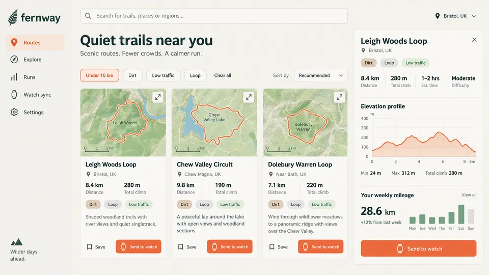
Pull every button, card, and form input out of a screenshot as composable React components with all states.

· You bring UI screenshot· Button.tsx· Card.tsx· FormInputs.tsx

Extract Buttons
Claude Opus 5.5High

Extract and recreate all button styles from this UI: Generate React components for: 1. Primary button 2. Secondary button 3. Ghost/text button 4. Icon button (if present) Each button should include: - All states (default, hover, active, disabled) - Proper TypeScript props interface - Tailwind CSS styling matching the original - Size variants (sm, md, lg)

13 lines · 358 charsEditorExpand
AttachmentsResponse
CODE$0.24Run
COMPOSEtsx
import React, { useState } from 'react';
import { PrimaryButton } from './PrimaryButton';
import { SecondaryButton } from './SecondaryButton';
import { GhostButton } from './GhostButton';
import { IconButton } from './IconButton';
import { WatchIcon, BookmarkIcon, ExpandIcon, CloseIcon, ChevronDownIcon } from './icons';
import type { ButtonSize } from './types';

const sizes: ButtonSize[] = ['sm', 'md', 'lg'];

const Section: React.FC<{ title: string; children: React.ReactNode }> = ({ title, children }) => (
  <section className="rounded-xl border border-[#E8E5DD] bg-white p-6" aria-labelledby={title}>
    <h2 id={title} className="mb-4 text-lg font-semibold text-[#1B3A34]">{title}</h2>
    <div className="space-y-4">{children}</div>
  </section>
);

const Row: React.FC<{ children: React.ReactNode }> = ({ children }) => (
  <div className="flex flex-wrap items-center gap-4">{children}</div>
);

export const ButtonShowcase: React.FC = () => {
  const [filters, setFilters] = useState<Record<string, boolean>>({ 'Under 10 km': true, Dirt: false, 'Low traffic': false, Loop: false });
  const toggle = (k: string) => setFilters((f) => ({ ...f, [k]: !f[k] }));

  return (
    <main className="min-h-screen bg-[#FAF8F3] p-8 font-sans text-[#1F2A27]">
      <h1 className="mb-8 text-4xl font-bold text-[#123029]">Fernway buttons</h1>
      <div className="grid gap-6 lg:grid-cols-2">
        <Section title="Primary">
          <Row>{sizes.map((s) => <PrimaryButton key={s} size={s} leftIcon={<WatchIcon />}>Send to watch</PrimaryButton>)}</Row>
          <Row>
            <PrimaryButton disabled leftIcon={<WatchIcon />}>Disabled</PrimaryButton>
            <PrimaryButton loading>Sending…</PrimaryButton>
          </Row>
          <PrimaryButton size="lg" fullWidth leftIcon={<WatchIcon className="h-6 w-6" />}>Send to watch</PrimaryButton>
        </Section>

        <Section title="Secondary">
          <Row>
            {Object.keys(filters).map((k) => (
              <SecondaryButton key={k} selected={filters[k]} onClick={() => toggle(k)}>{k}</SecondaryButton>
            ))}
          </Row>
          <Row>{sizes.map((s) => <SecondaryButton key={s} size={s}>Dirt</SecondaryButton>)}</Row>
          <Row>
            <SecondaryButton pill={false} rightIcon={<ChevronDownIcon />} className="min-w-[196px] justify-between">Recommended</SecondaryButton>
            <SecondaryBut…
Button.tsx77 lines · 3.6k chars
CODE
IMAGE
Upload UI Screenshot
Upload UI Screenshot16:9
IMAGE
Extract Cards
Claude Opus 5.5High

Extract and recreate card components from this UI: Generate React components for card patterns visible: 1. Basic card with padding and border 2. Card with header/body/footer sections 3. Interactive card (if hover states visible) Include: - TypeScript props for customization - Tailwind CSS matching the exact shadows, borders, radius - Responsive behavior - Composable sub-components (CardHeader, CardContent, etc.)

12 lines · 417 charsEditorExpand
AttachmentsResponse
CODE$0.35Run
COMPOSEtsx
import React from 'react';
import { TrailCard } from './TrailCard';
import { RouteDetailCard } from './RouteDetailCard';
import { Tag, Trail } from './types';

const tags: Tag[] = [
  { label: 'Dirt', variant: 'dirt' },
  { label: 'Loop', variant: 'loop' },
  { label: 'Low traffic', variant: 'traffic' }
];

const trails: Trail[] = [
  { id: 'leigh', name: 'Leigh Woods Loop', location: 'Bristol, UK', distance: '8.4 km', climb: '280 m', tags, mapLabel: 'Leigh Woods', description: 'Shaded woodland trails with river views and quiet singletrack.', routePath: 'M140 60 Q175 50 200 70 Q235 90 240 120 Q230 160 190 175 Q150 200 110 180 Q90 150 105 120 Q120 80 140 60Z' },
  { id: 'chew', name: 'Chew Valley Circuit', location: 'Chew Magna, UK', distance: '9.8 km', climb: '190 m', tags, mapLabel: 'Chew Valley Lake', description: 'A peaceful lap around the lake with open views and woodland sections.', lakePath: 'M40 70 Q90 60 110 110 Q130 170 110 190 Q70 200 50 150 Q30 110 40 70Z', routePath: 'M90 80 Q140 55 190 70 Q240 75 260 110 Q240 160 200 175 Q170 195 150 185 Q110 190 100 150 Q70 110 90 80Z' },
  { id: 'dolebury', name: 'Dolebury Warren Loop', location: 'Near Bath, UK', distance: '7.1 km', climb: '220 m', tags, mapLabel: 'Dolebury Warren', description: 'Wind through wildflower meadows to a panoramic ridge with views over the Chew Valley.', routePath: 'M150 75 Q185 70 210 100 Q240 125 220 160 Q195 200 160 195 Q115 175 100 130 Q105 90 150 75Z' }
];

const App: React.FC = () => (
  <main className="min-h-screen bg-[#f5f3ee] p-4 font-sans sm:p-8">
    <div className="mx-auto grid max-w-7xl gap-6 xl:grid-cols-[1fr_450px]">
      <div className="grid gap-5 sm:grid-cols-2 lg:grid-cols-3">
        {trails.map((t) => <TrailCard key={t.id} trail={t} />)}
      </div>
      <RouteDetailCard
        name="Leigh Woods Loop"
        location="Bristol, UK"
        tags={tags}
        stats={[{ value: '8.4 km', label: 'Distance' }, { value: '280 m', label: 'Total climb' }, { value: '1–2 hrs', label: 'Est. time' }, { value: 'Moderate', label: 'Difficulty' }]}
        elevation={[70, 80, 110, 150, 140, 110, 105, 150, 200, 210, 180, 150, 160, 200, 240, 220, 170, 180, 150, 100, 60, 35]}
        distanceKm={8.8}
        summary={{ min: '24 m', max: '312 m', climb: '280 m' }}
        weeklyTotal="28.6"
        weeklyChange="+12% from last week"
        weekly={[{ day: 'Mon', km: 3 }, { da…
Card.tsx41 lines · 2.6k chars
CODE
Extract Form Inputs
Claude Opus 5.5High

Extract and recreate form input components from this UI: Generate React components for: 1. Text input 2. Select/dropdown (if present) 3. Checkbox/radio (if present) 4. Form labels and error states Include: - Full TypeScript typing - Tailwind CSS matching exact styles - All states (focus, error, disabled) - Accessible markup with proper ARIA

13 lines · 344 charsEditorExpand
AttachmentsResponse
CODE$0.28Run
COMPOSEtsx
import React, { useState } from 'react';
import { TextInput, SearchIcon } from './TextInput';
import { Select } from './Select';
import { FilterChipGroup } from './FilterChip';
import { RadioGroup } from './RadioGroup';

const filters = [
  { value: 'under10', label: 'Under 10 km' },
  { value: 'dirt', label: 'Dirt' },
  { value: 'lowtraffic', label: 'Low traffic' },
  { value: 'loop', label: 'Loop' },
];

const sortOptions = [
  { value: 'recommended', label: 'Recommended' },
  { value: 'distance', label: 'Distance' },
  { value: 'climb', label: 'Total climb' },
  { value: 'nearest', label: 'Nearest' },
];

const FormDemo: React.FC = () => {
  const [query, setQuery] = useState('');
  const [selected, setSelected] = useState<string[]>(['under10']);
  const [sort, setSort] = useState('recommended');
  const [surface, setSurface] = useState('dirt');

  return (
    <main className="min-h-screen bg-[#f6f4ee] p-8 font-sans">
      <form role="search" className="mx-auto flex max-w-[980px] flex-col gap-8" onSubmit={(e) => e.preventDefault()}>
        <TextInput
          label="Search trails"
          hideLabel
          type="search"
          placeholder="Search for trails, places or regions..."
          leadingIcon={<SearchIcon />}
          value={query}
          onChange={(e) => setQuery(e.target.value)}
        />

        <div className="flex flex-wrap items-start justify-between gap-4">
          <FilterChipGroup legend="Trail filters" options={filters} selected={selected} onChange={setSelected} onClear={() => setSelected([])} />
          <Select label="Sort by" inlineLabel options={sortOptions} value={sort} onChange={(e) => setSort(e.target.value)} />
        </div>

        <section className="grid gap-6 rounded-xl border border-stone-200 bg-[#fbfaf6] p-6 md:grid-cols-2" aria-labelledby="states-heading">
          <h2 id="states-heading" className="text-xl font-bold text-[#1f3a33] md:col-span-2">Field states</h2>
          <TextInput size="md" label="Route name" placeholder="Leigh Woods Loop" hint="Shown on your watch." />
          <TextInput size="md" label="Distance (km)" defaultValue="-3" error="Distance must be greater than 0." required />
          <TextInput size="md" label="Location" placeholder="Bristol, UK" disabled />
          <Select label="Difficulty" options={[{ value: 'easy', label: 'Easy' }, { value: 'moderate', label: 'Moderate' },…
FormInputs.tsx59 lines · 2.8k chars
CODE
Run all

A real run, unedited3 generations · $0.87 of walletBrand and inputs are fictional, made in Vmotif · 2026-09-24

What came back

Straight off the canvas.

Everything below is what this run returned, untouched.

  • Button.tsxtsx
    import React, { useState } from 'react';
    import { PrimaryButton } from './PrimaryButton';
    import { SecondaryButton } from './SecondaryButton';
    import { GhostButton } from './GhostButton';
    import { IconButton } from './IconButton';
    import { WatchIcon, BookmarkIcon, ExpandIcon, CloseIcon, ChevronDownIcon } from './icons';
    import type { ButtonSize } from './types';
    
    const sizes: ButtonSize[] = ['sm', 'md', 'lg'];
    
    const Section: React.FC<{ title: string; children: React.ReactNode }> = ({ title, children }) => (
      <section className="rounded-xl border border-[#E8E5DD] bg-white p-6" aria-labelledby={title}>
        <h2 id={title} className="mb-4 text-lg font-semibold text-[#1B3A34]">{title}</h2>
        <div className="space-y-4">{children}</div>
  • Card.tsxtsx
    import React from 'react';
    import { TrailCard } from './TrailCard';
    import { RouteDetailCard } from './RouteDetailCard';
    import { Tag, Trail } from './types';
    
    const tags: Tag[] = [
      { label: 'Dirt', variant: 'dirt' },
      { label: 'Loop', variant: 'loop' },
      { label: 'Low traffic', variant: 'traffic' }
    ];
    
    const trails: Trail[] = [
      { id: 'leigh', name: 'Leigh Woods Loop', location: 'Bristol, UK', distance: '8.4 km', climb: '280 m', tags, mapLabel: 'Leigh Woods', description: 'Shaded woodland trails with river views and quiet singletrack.', routePath: 'M140 60 Q175 50 200 70 Q235 90 240 120 Q230 160 190 175 Q150 200 110 180 Q90 150 105 120 Q120 80 140 60Z' },
      { id: 'chew', name: 'Chew Valley Circuit', location: 'Chew Magna, UK', distance: '9.8 km', climb: '190 m', tags, mapLabel: 'Chew Valley Lake', description: 'A peaceful lap around the lake with open views and woodland sections.', lakePath: 'M40 70 Q90 60 110 110 Q130 170 110 190 Q70 200 50 150 Q30 110 40 70Z', routePath: 'M90 80 Q140 55 190 70 Q240 75 260 110 Q240 160 200 175 Q170 195 150 185 Q110 190 100 150 Q70 110 90 80Z' },
  • FormInputs.tsxtsx
    import React, { useState } from 'react';
    import { TextInput, SearchIcon } from './TextInput';
    import { Select } from './Select';
    import { FilterChipGroup } from './FilterChip';
    import { RadioGroup } from './RadioGroup';
    
    const filters = [
      { value: 'under10', label: 'Under 10 km' },
      { value: 'dirt', label: 'Dirt' },
      { value: 'lowtraffic', label: 'Low traffic' },
      { value: 'loop', label: 'Loop' },
    ];
    
    const sortOptions = [
How it runs

One stage, all at once.

What each stage reads, what it makes and what it cost on this run. Steps inside a stage don’t wait on each other, so they run side by side.

  1. 01

    3 files

    Reads your inputs

    • Extract Buttons
    • Extract Cards
    • Extract Form Inputs

    3 steps, side by sideClaude Opus 5.5$0.87

From your agent

Or let your agent run it.

This run went through the Vmotif MCP server, the way Claude Code, Cursor or any MCP client drives it: seed the canvas, fill the inputs, run the graph.

create_canvas({ premade_workflow_id: "ui-component-extractor" })
update_canvas({ canvas_id, updates: [/* your inputs */] })
run_workflow({ workflow_id: canvas_id })
MCP docs
Where it fits

Part of a bigger job.

More in Design → code

Drop in a screenshot, a live URL, or a brand reference and get production-ready front-end code back.